
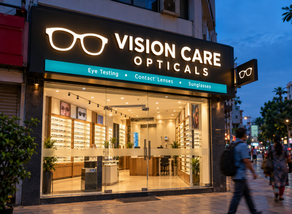
A good optical board design tells people three things in under five seconds: this shop sells eyewear, it does eye tests, and it looks trustworthy enough to walk into. Everything else (colour, lighting, material) exists to make those messages land faster.
That sounds simple. Yet most optician stores in Indian markets still hang the same blue flex sheet with a pair of clip-art glasses, and then wonder why customers walk past to the chain store two doors down.
This guide shares 15 optical board design ideas we’ve seen work for small opticians, eye clinics and premium eyewear boutiques, along with the materials, sizes and cost factors you should know before ordering.
What makes a good optical shop board design?
The best optical shop board design is clean, well lit and readable from across the road. In short:
- Shop name in large, simple lettering that reads from 30 to 40 feet away
- One clear eyewear symbol, such as a spectacle outline
- Services listed in a single line (eye testing, contact lenses, sunglasses)
- Lighting that works after sunset, since a lot of eyewear shopping happens in the evening
- A colour scheme that feels clinical yet friendly, usually white, blue, teal or black
A cluttered optical board looks like a discount stall. A calm one looks like a place you’d trust with your eyes.
15 optical board design ideas for optical shops
1. Spectacle outline as the hero
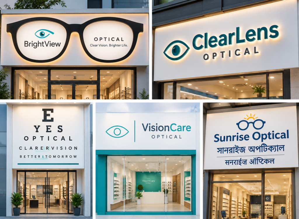
Turn the shop name into part of a large spectacle frame, with the two lenses holding the logo and tagline. It’s the most recognisable optical board design there is, and it works at any size.
2. Backlit acrylic with raised letters
A white backlit panel with 3d acrylic letters on top gives depth by day and a soft glow at night. Premium stores love this one.
3. Eye chart inspired fascia
Arrange the shop name in rows of shrinking letters, like a Snellen chart. People smile when they notice it. Keep the smallest row large enough to read, though.
4. Minimal white and teal
White base, teal accents, one thin line icon. This clinic-style look suits optometrist-led stores that want to signal expertise first and fashion second.
5. Bilingual board
Add the shop name in Bengali, Hindi or your local language beneath the English name. In neighbourhood markets, many older customers read the local script faster.
6. Neon-style glasses icon
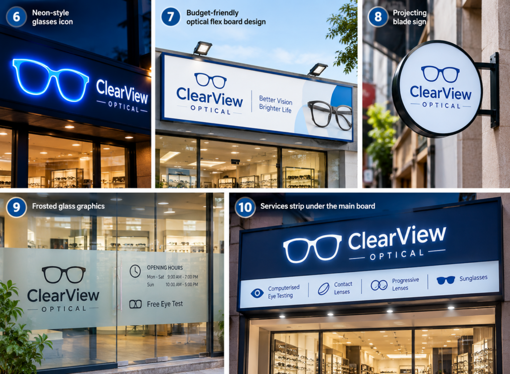
A glowing LED neon flex outline of glasses beside the name catches eyes after dark. It also photographs well, which helps on Instagram and Google Maps listings. The look borrows from the classic neon sign, without the fragile glass tubes.
7. Budget-friendly optical flex board design
New to the business? A good optical flex board design with sharp print, a bold logo and plenty of empty space still looks professional. Pair it with a clean MS frame and two LED floodlights.
8. Projecting blade sign
In narrow lanes, people walk parallel to your shop and never see the front fascia. A small double-sided optical board fixed at a right angle to the wall solves that.
9. Frosted glass graphics
If your shopfront is mostly glass, use frosted vinyl for the logo, timings and “Free Eye Test” message. It keeps the display of eyeglasses visible from outside while adding privacy at the testing area.
10. Services strip under the main board
A slim panel listing computerised eye testing, contact lenses, progressive lenses and sunglasses answers questions before customers ask. Keep it to four or five items.
11. Boutique look with metal letters
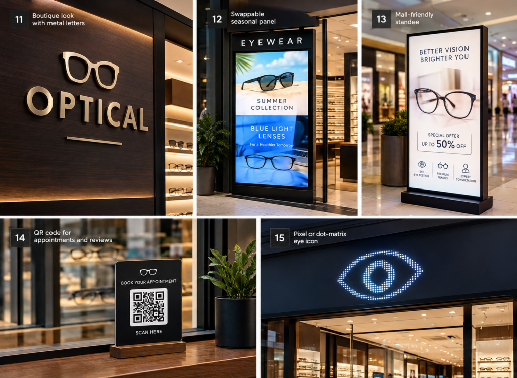
Brushed steel or brass letters on a dark wood-finish or black ACP base suit high-end stores selling designer frames. This optical sign board design whispers “premium” without saying it.
12. Swappable seasonal panel
Keep one section of the board changeable. Sunglasses in summer, blue-light lenses during exam season, festive offers in October. Your fascia stays fresh without a full redesign.
13. Mall-friendly standee
Inside malls, the fascia is often fixed by mall rules. A lit floor standee near the entrance with your best offer pulls in people walking the corridor.
14. QR code for appointments and reviews
Add a small QR code linking to your booking page or Google reviews. It’s a quiet detail, but it turns window shoppers into appointments, even when the shop is closed.
15. Pixel or dot-matrix eye icon
For a modern, slightly techy feel, build the eye or glasses icon from LED dots. Programmable LEDs can even make the icon blink or animate, which suits a younger crowd.
Best materials for an optical sign board design
The material decides how long your board looks new. Here’s how the common options compare:
- Flex on an MS frame. Cheapest and quickest. Fine for a first store, but expect fading within a year or two of direct sun and monsoon rain.
- Aluminium composite panel (ACP) with vinyl or acrylic. Flat, rust-free and long-lasting. This is the standard base for most optical shop board design work today.
- Acrylic, also known as PMMA. Glossy, takes light beautifully and suits backlit boards and raised lettering.
- Stainless steel or brass letters, for boutiques that want a polished, lasting finish.
- LED modules or neon flex, for any board that needs to work after dark.
If you’re choosing lights, sealed outdoor-rated modules matter far more than raw brightness. Any experienced LED sign board manufacturer in Kolkata retailers work with will tell you that water getting into the light box is the main reason lit boards fail in the rains.
What size should an optical board be?
Match the board to your frontage and to how far away people will read it. A handy rule is about 1 inch of letter height for every 10 feet of viewing distance.
Board type | Common size | Where it works |
Main fascia board | 8 x 3 ft to 16 x 4 ft (full shop width) | Street-facing shops |
Projecting blade sign | 2 x 2 ft to 3 x 2 ft | Narrow lanes and markets |
Services strip | Full width x 1 to 1.5 ft | Below the main board |
Floor standee | 2 x 5 ft to 2 x 6 ft | Malls and shop entrances |
Glass vinyl graphics | Sized to the glass panel | Glass shopfronts |
What affects the cost of an optical board design?
No two quotes look alike, because the price of an optical board depends on a handful of choices:
- Size, since most boards are priced by the square foot
- Material, with flex at the low end and metal letters at the top
- Lighting type (non-lit, front-lit, backlit, neon flex or programmable LED)
- Letter style, as flat printed text costs less than cut or 3D raised letters
- Design complexity, including custom icons, shapes and bilingual text
- Installation height, scaffolding needs and any night work on busy roads
- Permissions, if your municipality or mall needs approval for the board
A practical tip: spend more on the main fascia and keep secondary signs simple. Your front board does most of the selling.
FAQs
Which colour is best for an optical board design?
White, blue and teal feel clean and medical. Black with gold suits premium stores.
Is LED better than flex for an optical shop board design?
Yes, if the board faces a busy road or you stay open late. Flex is fine for a short-term or budget start.
How long does an optical sign board design take to make?
Usually three to seven working days after the design is approved, longer for metal or LED letters.
Can I put brand logos of frames I sell on my board?
Only with the brand’s permission. Many brands supply approved artwork.
Does a good optical board design really bring more customers?
It helps people notice and trust you, which is where every sale starts.
Get your optical board designed
Your board works every hour the shop is open, so make it count. Send Shree Shyam Signages a photo of your shopfront and your logo on WhatsApp, and we’ll design a free optical shop board design mock-up for you. Call us today to book a site visit anywhere in Kolkata.